About

Work

Contact

State Transit Tracker App
UX/UI Design Case Study of how I approach each step of the process
A Midwestern transportation agency for a mid-size metropolitan area with a network of public buses that serves thousands of commuters a day. They currently list the expected bus schedule on a responsive website and also post it at each bus stop. However, expected bus times are rarely accurate and due to expansion they need a better way to relay information to commuters.
Processes
User Research | Competitive Analysis | Personas | User Stories | User Flow | Site Map | Sketches | Wireframing
| Lo-Fidelity Prototyping | Usability Testing | Visual Design | Branding and Identity | Hi-Fidelity Prototyping
Methodologies
UX Design Thinking | Lean UX
Technology
Figma | Photoshop | Illustrator
Problem and Plan
State Transit officials found that:
Due to the expansion of bus routes, many routes stop at the same bus stop at the same time. Commuters mostly complained about the bus stop at Washington and State,
which serves 7 bus lines:
-
When the next bus will arrive at each stop?
-
How much time do they have to get to the bus stop before their selected bus arrives? (Now with 7 bus lines, rushing to the stop when they see a bus no longer works.)
Survey, Personas and Competitive analysis
User stories, User Flows
Sketches
Refinements
Testing
Usability Testing
Present to Development and Deliver
Wireframes,
Branding, Mockups
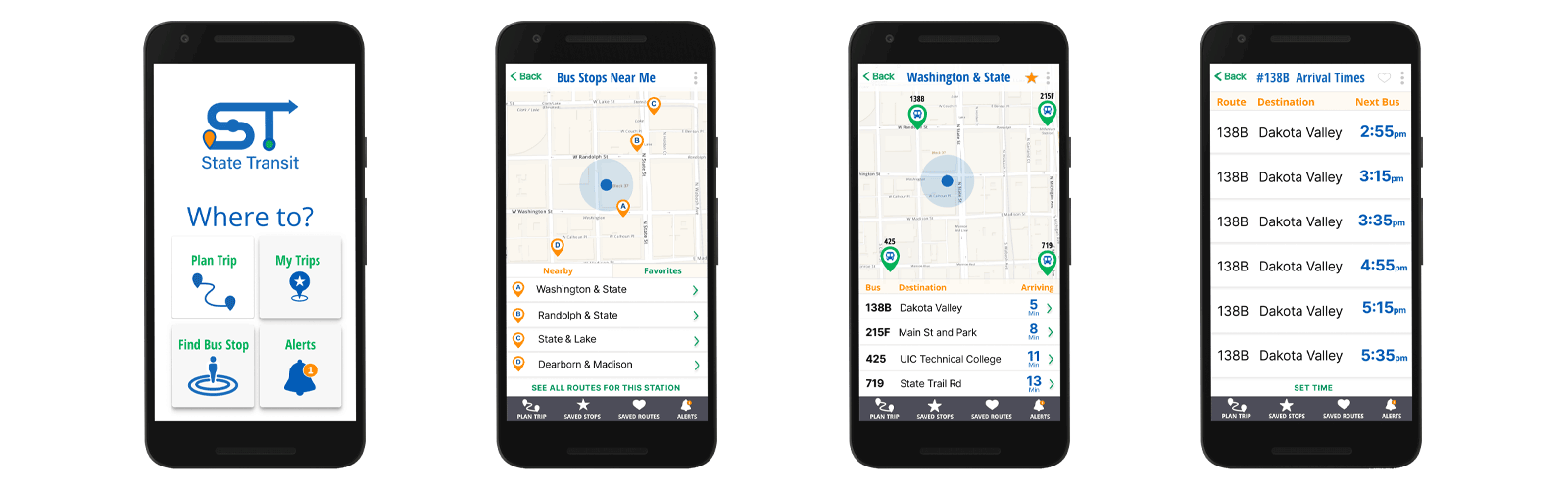
Solution
Design a mobile app like Google that would be able to allow users to see the bus stops nearest them and figure out the next bus that will be arriving at that stop. The user will then be able to get details of how often that bus arrives at that stop.
To address the issues related to the Washington & State bus stop, the app will include the following:
-
Which bus routes service the stop?
-
How many minutes until the bus arrives?
-
How frequently is each bus arriving at that location?
-
Clearly label the busses on a map?
Research & Discovery
Research was needed to:
-
Ensure I understood the commuters needs.
-
Discover their motivations and frustrations with the current apps they were using.
Questions to be answered:
-
How often did riders take the bus?
-
How many busses did riders take to get to a destination?
-
What devices do they use when looking up bus information?
-
Do they currently use an app to plan their commute? If not, what is their go-to source when planning their commute?
-
What features do they like, dislike or find important about familiar apps?
-
What information/feature would you like to see upon opening the app?
Survey Results


User Survey Highlights

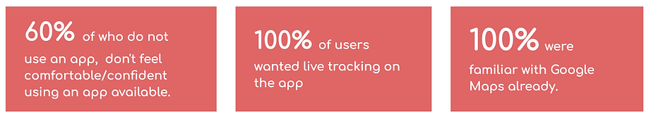
Creating surveys helped me to thoroughly empathize with the commuters and understand their needs, motivations and frustrations. My biggest takeaway from conducting the user survey was seeing that bus riders weren’t absolutely happy with their current options. They either didn't feel confident using one at all, or they were familiar mostly with Google Maps. I knew I needed to make a very simplified design
Key Takeaways
Competitive Analysis
I look into the major players of the public transit market first to find out how State Transit Bus App could enter the market.

Focused on 2: Google and Moovit


Liked that it shows you right where you are on the map. If you are not using the trip planner for driving the other features are not the best for bus riding.


Liked how they maximized the screen space and could View All of the lines for this station

User Personas


Daily Rider Non-App User
Daily Rider - Regular App User

Daily Rider - Regular App User

User Stories
Assuring I stick to the product goals again:
-
Ensure that any rider can tell when each of the buses arrives at the Washington & State bus stop.
-
Ensure that all riders can tell how much time they have to get to the Washington & State bus stop before the bus they need arrives at that stop.
-
Allow riders to select one of seven bus lines to see a list of their future arrival times at the Washington & State bus stop.
Prioritized user stories for MVP

* Because there were the three personas the roles were important in regards to users familiarity with the app or apps in general
As a user I need to:
-
Find out what time the bus is coming to Washington and State.
-
Find bus stops near me (at Washington and State).
-
Select bus stop at Washington and State.
-
Select bus to my destination.
-
Look at what time the bus is coming to Washington and State.
Sketches


After many sketches, I kept the app very simple to ensured the users could be confident using the app right away.
User Flows
The mock up clearly shows the user’s journey I could use to plan the screens for the app.

-
User opens the app.
-
Clicking a button to immediately locate a bus stop near them,
-
User chooses Washington and State as the closest location,
-
User is given a list of buses based on the time they would leave the stop,
-
User can then get details on how often that bus arrives at that location.
Wireframes for Usability Testing

Wireframes
Usability Test Results: Round #1
-
Participants found the app easy to figure out and were able to assume that it was a map app for buses.
-
It was also mentioned that the interface was simple and straightforward.
-
Also pointed out a few design flaws that needed to be addressed:
-
Testers were confused with the “heart and star icon” which was placed so that users could “Save” a bus stop to my Buses and select a bus route as a “Favorite”.
-
They felt that all icons on the map should be labeled since it would help users gain familiarity of where each feature is located.
-
Iteration: Round #1

-
My first sketches and designs focused a little too much on a larger-scale app. I learned that I should have stuck to the main problem and addressed that first.
-
That also made it confusing for user testing. So I took away the other buttons on the home screen and the “save” icons and will present those to the client as enhancements for later. This way, we can stay within budget and not have scope creep.
Branding and Identity
Sketches and Moodboard


I created a mood board in Figma with colors and an array of screenshots from competitors. This way I could design a logo that stood out strong among competitors, but was also similar enough people would recognize it as a viable app. I used all colors that contrast well with each other and looked good on the white screen for accessibility reasons.
Graphic Iconography Process


Applying Branding and Testing Accessibility
I incorporated colors not just for visual aesthetics but for hierarchy of information with color coding, and clearly marking stops and the buses on the map.

Usability Testing Round #2
UserZoom Testing
This time, usability tests were performed through UserZoom. Participants were given the scope of the project, outlining the purpose of the test, and a link to click on.

Participants were given instructions through UserZoom to:
-
Find the bus stop nearest them.
-
Figure out the next bus that will be arriving at that stop.
-
Get details on how often that bus arrives at that stop.
At the end, we are also encouraged to:
-
Give any feedback on aspects of the design
-
Recap any questions they had along the way
The session recorded:
-
Amount of time to complete the task
-
How much they clicked around outside the instructions I gave them.
-
If they encountered any errors
Clickable Demo

Usability Test Results: Round #2


Participants in this round gave useful feedback, that was mostly focused on content, not usability:
-
Page Titles could be more explanatory
-
A few labels were not clear and could be worded differently.
-
The times on screen #4 should be the actual time the bus should arrive, not the time in minutes since they may not be starting the trip that very minute.
They gave positive feedback on the visual aspects of the design:
-
They liked how "the colors helped you to know what you were doing" and that they helped to label features without words.
-
They liked how it looked a lot like Google Maps an app they were very familiar with.
Iteration: Round #3

MVP Product Summary

State Transit Mobile App MVP
This version was a solution to the current problem of riders, as requested by the client, for the following reasons:
-
Any rider can tell when each of the buses arrives at the Washington & State bus stop.
-
Users can select/be located at the Washington and State bus stop while there.
-
Users have access to seeing all lines arriving at the bus stop of their choice after selecting the bus stop nearest to them (or of their choice).
On screen 3:
-
Users are able to easily view the location of the next arriving bus that's within short walking distance.
-
Any rider can tell when each of the buses arrives at the Washington & State bus stop.
-
Bus locations are properly labeled with their line number, so users are never confused as to which direction their bus is coming from.
-
Hierarchy is applied within the list to show which bus is coming next.
-
All riders can tell how much time they have to get to a bus stop before their desired bus arrives.

On screen 4:
-
Riders can select 1 of 7 bus lines to see a list of their future arrival times at the Washington & State bus stop.
-
Users are able to easily view the full list of times in which a selected bus is arriving at the Washington and State Bus stop or any stop of their choice.

Post MVP
Transit Tracker App - Version 2
Version 2 was created after:
-
initial competitive analysis was more closely considered.
-
additional research and data were collected from surveys and participant feedback.

Based on Research:
-
40% of riders will need to transfer buses. Most riders take 1 or 2 buses to get to a destination,
-
Adding a “Trip Planner” to the app would allow riders to enter a destination and plan a trip from any starting point, making the app much more robust to compete with the market.
-
Many riders take the same routes often:
-
They should not have to look up bus times and schedules over and over.
-
Having a “save trip” or “tag” option would allow users to quickly navigate to a commonly attended bus stops from any location.
-
-
Users wanted animated live tracking features:
-
showing their bus moving along the map (nice to have feature)
-
-
Adding buttons to the home screen for “My Buses and Stops” and “My Trips”
-
Adding “Save Stop” and “Save Route” features to pages

-
Giving users the ability to save bus stops they frequently go.
-
Giving the users the ability to set up alerts for regular routes they take.
-
Allow users to search based on destination, not just bus stop. (incorporating a trip planner when the user needs to transfer buses)
-
Incorporating a navigation function to be able to find a bus stop.
MVP


Version 2

